


More Bookings.
Less Admin. On AutoPilot.
Less Admin.
Our Work
Our System
A simple system which runs like clockwork, guaranteed to capture more customers.
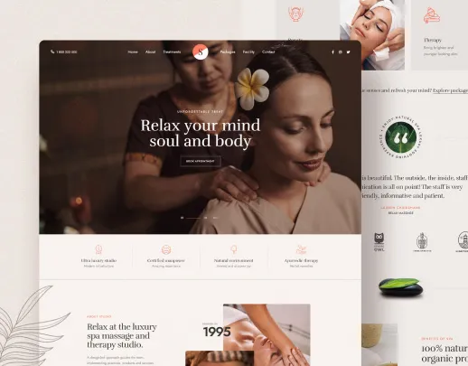
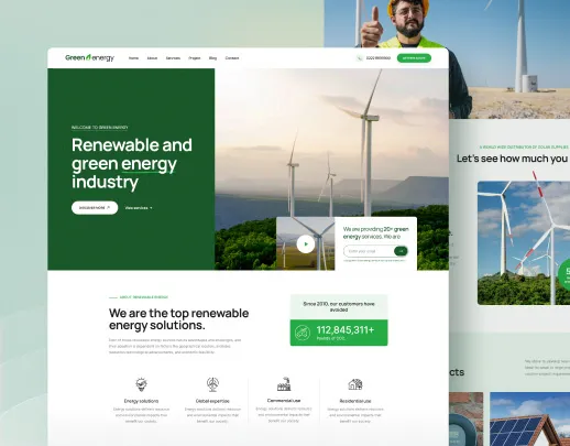
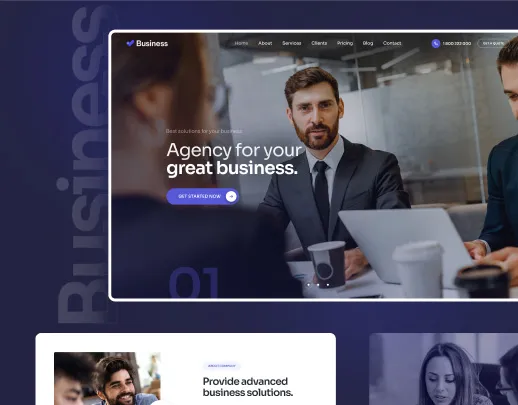
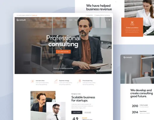
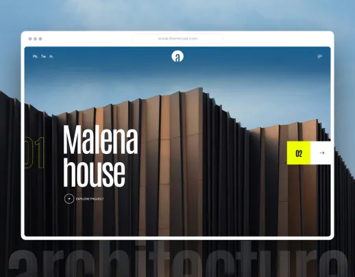
SEO-Driven Website That Ranks #1
Custom-built, fast-loading website optimized to dominate local search results and convert visitors into bookings.
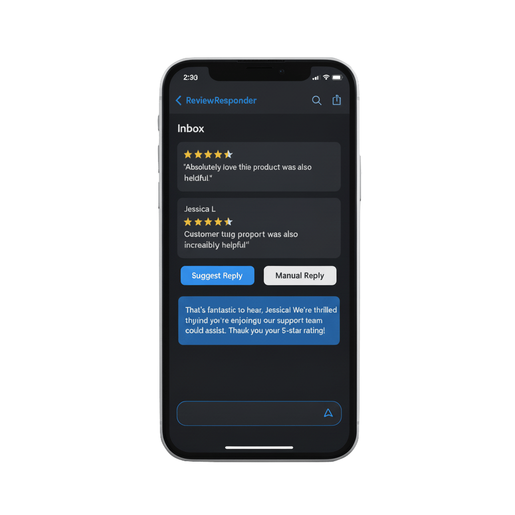
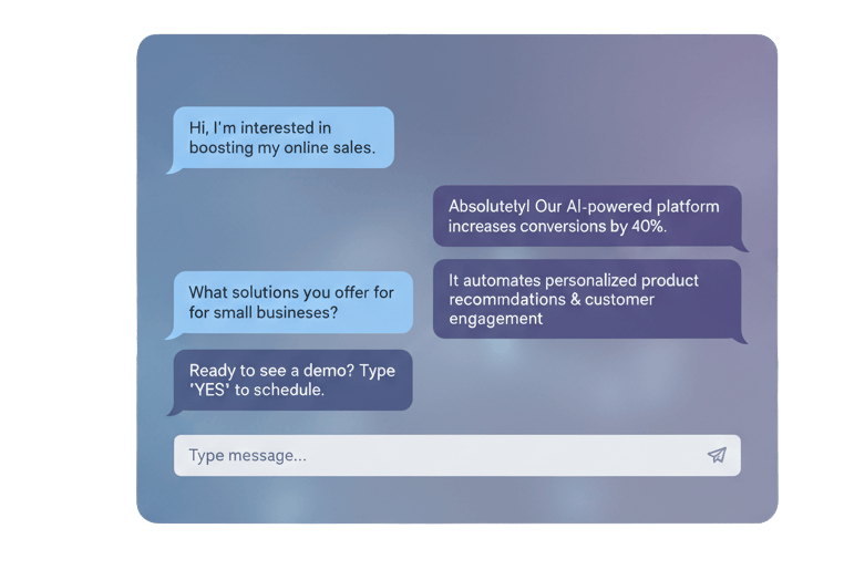
24/7 AI Automation System
AI handles phones, bookings, social media, and customer service while preserving your authentic brand voice.
Local Partnership + Territorial Protection
Hands-on support with exclusive access—no local competitors get this advantage.
Do these problems ring a bell? 🛎️
Let's stop that headache and grow your business.
Losing customers to after-hours calls and unanswered messages?
Our AI automation captures every opportunity 24/7 while you focus on clients.
Spending 15+ hours weekly on booking admin and customer service?
We automate it all—guaranteed 15 hours back in your week within 60 days.
Website that doesn't rank or convert visitors into bookings?
Custom SEO-driven sites that dominate local search and guarantee 30% more enquiries.
What's Included in Our Three-Pillar System
Everything a service businesses needs to dominate their market.
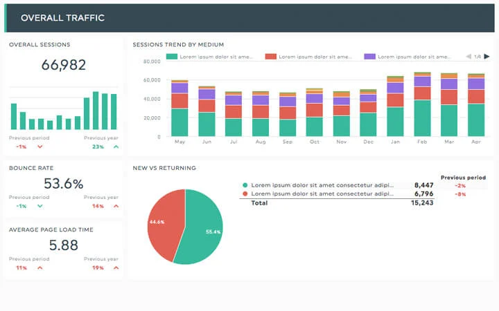
Real-Time Business Intelligence Dashboard
See exactly how your website and AI automation perform. Every month, get a detailed performance report showing SEO rankings, traffic growth, enquiries captured, and revenue generated. Plus, our customer interaction analytics show you exactly where leads come from and how they convert.
- Real-time SEO ranking & traffic tracking
- AI conversation analysis & optimization
- Customer journey and conversion insights
What Our Clients Say
Join hundreds of satisfied customers who've transformed their businesses
"My business changed dramatically after making the switch from Squarespace to Aspect Studio. My business model and environment is in constant flux, so having the freedom to change things up with maximum flexibility has been invaluable for me - not least because of the excellent on hand care, communication and 'going the extra mile'. Their design and SEO expertise boosted my website to the top of search rankings, I owe a lot to Aspect Studio!"
Al Robertson
Creative Services
"From start to finish this has been a surprisingly brilliant and quite magical experience. Having had some bad experiences with various designers - this has been like a breath of fresh air. I can say with my hand on my heart that it is as though he read my mind and even things I had not mentioned, I had only dreamed of having have been incorporated within the site. I did not make one change, not one single amendment was made to what he created - I was literally blown away!"
Penelope Arnold
Viva Flowers
"After years of DIY website frustration and feeling like my website is not helping us grow, working with Jack at Aspect Studio has been like night and day. Jack actually listens (a rare quality these days!) and his unlimited updates model means my site evolves as my business does. For the first time, I'm actually proud to share my website."
Paras Sheth
Business Owner
"It is such a breath of fresh air to work with people like Jack. Ditching Wix for something custom-built gave my business the flexibility it needed. It feels like a premium service and I can't believe what I'm getting for what I pay. They are not just service providers. They feel like partners who genuinely care."
Libby Blunt
Videography
"Really helped kickstart my retail business. Made the website side of my business swift, easy, and totally stress free."
Ben Allen
Retail Business
"Really great, friendly service from start to finish. Project was finished ahead of time and good value for money"
Sebastian Davis
Professional Services
"Brilliant job done. Exactly what I needed. Can't recommend more"
Freddie Scott-Soundy
Consulting
"Truly impressive!!"
Kitson Dove-Edwin
Tech Startup
"Amazing service. The team went above and beyond to deliver exactly what we needed. Our website now converts much better and we're getting more leads than ever before."
Thomas Drew
E-commerce
"Professional, efficient, and results-driven. Couldn't be happier with the outcome."
Sarah Mitchell
Marketing Agency
"Game changer for our business!"
Mike Johnson
Local Business
Ready to Join Our Success Stories?
See how we can transform your business with our proven strategies
How It Works: From Consultation to Complete Transformation
No upfront costs, no tech headaches—just a complete business system that captures every opportunity while you focus on clients.
And when you need updates? Just drop a request in your dedicated portal.
1. Business Discovery & Strategy
20-minute consultation to understand your goals, challenges, and local market position.
2. Custom Website & SEO Foundation
Beautiful, fast-loading website built for your brand with local SEO optimization for #1 ranking.
3. AI Automation Setup & Training
24/7 AI systems trained on your services, pricing, and brand voice for perfect customer interactions.
4. 30-Day Complete Launch
Full system goes live within 30 days with monitoring, testing, and optimization.
5. Ongoing Optimization & Support
Monthly improvements, SEO updates, and AI refinements to continuously improve results.
6. Asset Ownership & Partnership
After 3 months, you own all systems while maintaining our optimization partnership and territorial protection.
Why We Don't Believe in One-Off Websites
The Math Makes Sense
Compare this to hiring a receptionist at £2,083/month (£25,000/year) - you save £19,000/year while getting 24/7 AI coverage that never calls in sick.
Why Our Three-Pillar System Wins
Plus territorial exclusivity - no local competitors get this advantage.
Complete Business Transformation
• 15+ hours saved weekly through AI automation
• #1 local search ranking with custom SEO website
• Own everything after 3 months + ongoing optimization
Subscription vs One-Off Websites
Both options include a custom website build. The difference is what happens after launch.
Subscription
Recommended for 95% of businesses
- Custom website build
- 24/7 AI chat & lead capture
- Automated lead notifications
- Google My Business management
- Social media cross-platform posting
- Email welcome sequences
- Monthly task requests via dashboard
- Strategy calls with local rep
- AI phone answering & booking
- Advanced lead nurturing
One-Off Build
Traditional approach
- Custom website build
- 24/7 AI chat & lead capture
- Automated lead notifications
- Google My Business management
- Social media cross-platform posting
- Email welcome sequences
- Monthly task requests via dashboard
- Strategy calls with local rep
- AI phone answering & booking
- Advanced lead nurturing
Get Your Website Free, Keep It Fresh Forever
Every subscription includes a fully custom-coded website build (worth £1,800+) plus unlimited ongoing care. No templates, no page builders, no hidden costs.
Starter
What you'd pay an employee: £1,489/month (£17,861/year). They save: £11,637/year vs hiring someone.
£6,225/year • 12-month commitment
- Custom website with mobile optimisation
- 24/7 AI chat answering questions and capturing leads
- Automated lead notifications (instant SMS/email to you)
- Google My Business management and optimisation
- Access to our social media cross‑platform posting tool
- Email welcome sequences for new leads
- Monthly ‘unlimited’ (not really unlimited) task requests via dashboard
- Monthly strategy call with your local rep if appealing
Growth
What you’d pay an employee: £2,977/month (£35,722/year) for a marketing coordinator. They save: £24,139/year vs hiring someone.
£11,583/year • 12-month commitment
- Everything in Starter, plus:
- 24/7 AI phone answering and appointment booking
- Advanced lead nurturing (5‑touch sequence)
- Automated cross‑platform content creator
- Review generation and reputation management
- Local SEO optimisation (dominate local search)
- SMS automation for appointments and follow‑ups
- Unlimited task requests via priority dashboard
- Bi‑weekly strategy sessions with local rep
Pro
What you’d pay employees: £4,466+/month (£53,583+/year) for marketing manager + assistant. They save: £36,642+/year vs hiring a team.
£16,941/year • 12-month commitment
- Everything in Growth, plus:
- Advanced AI that qualifies leads and books appointments
- Complete CRM with customer lifecycle automation
- Payment processing and invoicing integration
- Customer retention and upselling sequences
- Competitor monitoring and market insights
- Priority task queue with complex project capability
- Weekly strategy calls + quarterly business planning with local rep

Meet Jack👋
I'm Jack Schofield—passionate developer and designer tired of seeing London businesses struggle with disconnected agency relationships.
I founded Aspect Studio because I was fed up with big agencies treating clients like account numbers instead of real people with real businesses.
Each partnership is personal and hands-on—I want to understand your business deeply and transform it completely, not just deliver a project and disappear.
I want to be your dedicated technology partner who's always available, understands your local market, and genuinely cares about your success.
We'll build systems that work 24/7 while preserving what makes your business special. You'll own everything we create together after 3 months.
Honest Comparison
Aspect Studio vs. The Rest
We believe in transparency. Here's exactly how we stack up against every other option for getting your website performing. No fluff, just facts.
The Complete Comparison
| What Matters Most | Aspect Studio (That's Us!) BEST VALUE | DIY Platforms (Wix, etc.) | Freelancers Individual pros | Traditional Agencies Big firms | Other Subscription Competitors |
|---|---|---|---|---|---|
Your Investment | 👍 No big upfront costs, just simple monthly. | Low monthly, you do work | Upfront fee (££-£££) | High upfront fee (£££-££££) | Monthly, features vary |
Keeping Content Fresh | ✅ Unlimited & all done for you. | DIY, your time | Pay per update | Hourly charges apply | Often limited slower |
Design & New Features | ✅ Unlimited design tweaks & new bits included. | Template limits | Extra fees apply | New project, more fees | Limited / basic |
Getting Found (SEO) | ✅ Proactive SEO, always. | Basic tools, DIY | Basic setup, if any | Often separate, extra cost | Varies, often DIY support |
Local Know-How | 🇬🇧 London experts, we get you. | Global, impersonal | Varies | Can be local, but pricey | Often not London-focused |
Aspect Studio
That's Us!
Your Investment
👍 No big upfront costs, just simple monthly.
Keeping Content Fresh
✅ Unlimited & all done for you.
Design & New Features
✅ Unlimited design tweaks & new bits included.
Getting Found (SEO)
✅ Proactive SEO, always.
Local Know-How
🇬🇧 London experts, we get you.
Swipe or use arrows to compare • 1 of 5
The Choice is Clear
Why settle for less when you can get unlimited design, content updates, and expert SEO for less than what agencies charge for a single project?
Frequently Asked Questions
Everything you need to know about territorial AI automation
Ready to claim your territory?
UK Small Business Growth Hub
Practical strategies for British entrepreneurs ready to dominate their local markets. From London SEO tactics to conversion optimization—everything you need to turn your website into a customer magnet.

A guide for London's service SMEs on using AI for web design, advertising, and automation to reclaim hours and attract more customers without technical expertise.
A comprehensive guide to local business marketing strategy without the burnout. Learn how to market your business effectively without feeling overwhelmed.
Boost your London restaurant's online presence with these 5 essential SEO tips. Learn practical strategies to attract more customers and increase bookings through local search optimization.
Sign up for our newsletter
Stay updated with the latest news and offers
Ready to Transform Your Business With Our Three-Pillar System?
Join successful service businesses already capturing 30% more enquiries with SEO websites, AI automation, and local partnership. No upfront costs, guaranteed results in 30 days.